Project: Case Study - Enhancing UX of Mayo Clinic Website
Where What Why
ASU, United States Web Design Professional Project Work
Role Category When
UX Designer Healthcare Aug 2023 - Nov 2023
Tools

The Context
Mayo Clinic is a world-renowned medical institution known for excellence in patient care, research, and education. With over a century of history, it's a global leader in healthcare innovation and patient-centered care.

The Problem
The Mayo Clinic website faced usability issues, particularly with essential functions like "Request Appointment," "Log In," and "Create Account" flows. Users found it challenging to navigate these flows effectively, potentially hindering access to vital medical services.
The Objective
To enhance the user experience of key functions, including "Request Appointment," "Log In," and "Create Account" flows, on the Mayo Clinic website to facilitate smoother navigation and expedite access to essential medical services.

My responsibility as a UX designer was to carry out thorough planning and discovery research in order to pinpoint problems and suggest design fixes.
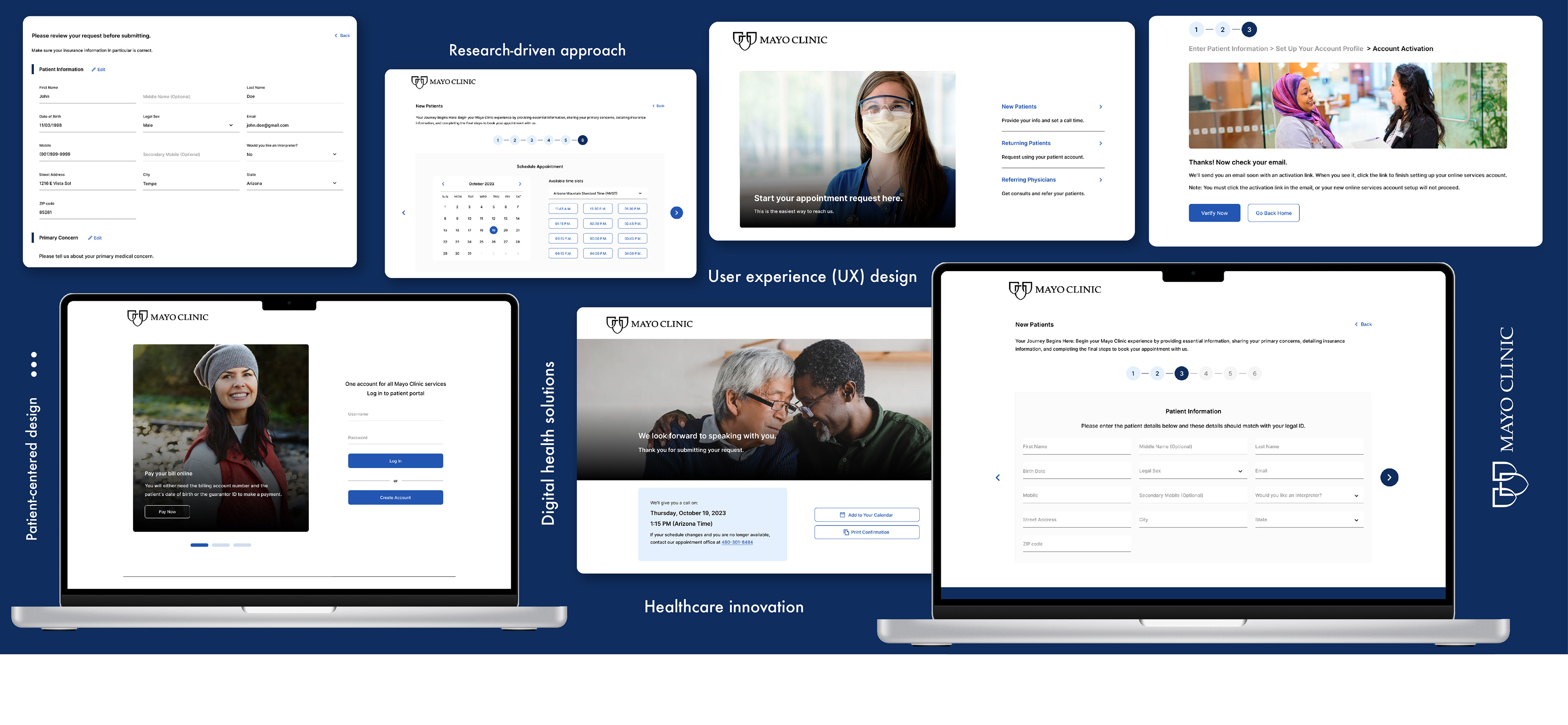
Design Process
The process of improving the user experience on the Mayo Clinic website started with careful planning, which included competitive analysis, user research, and heuristic evaluations to identify major pain points. This thorough ground work set the stage for an iterative process that included data analysis, ideation, prototyping, usability testing, and final actionable recommendations for a more polished and user-centered design.

Step 1: In-depth Research
Conducted competitive analysis and heuristic evaluations.
Heuristic Evaluation
Key findings:
1. Clear indicators of system status required.
2. Recognition over recall emphasized.
3. Appointment booking should be quick and straightforward.
4. Emphasis on error prevention and consistency.
Competitive Analysis
A competitive analysis of healthcare institutions, including the Mayo Clinic, Cleveland Clinic, and Johns Hopkins Medicine, uncovered clear-cut methodologies for effective navigation and information architecture.

Step 2: Design
Wireframes
Transformed user insights and Key findings from the research phase into visually appealing interfaces.


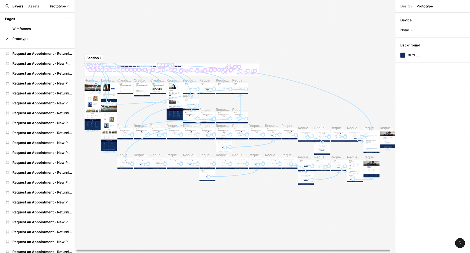
Step 3: Prototype
Created high-fidelity prototypes using tools like Figma, incorporating improved visual elements and intuitive interactions.

Home Page
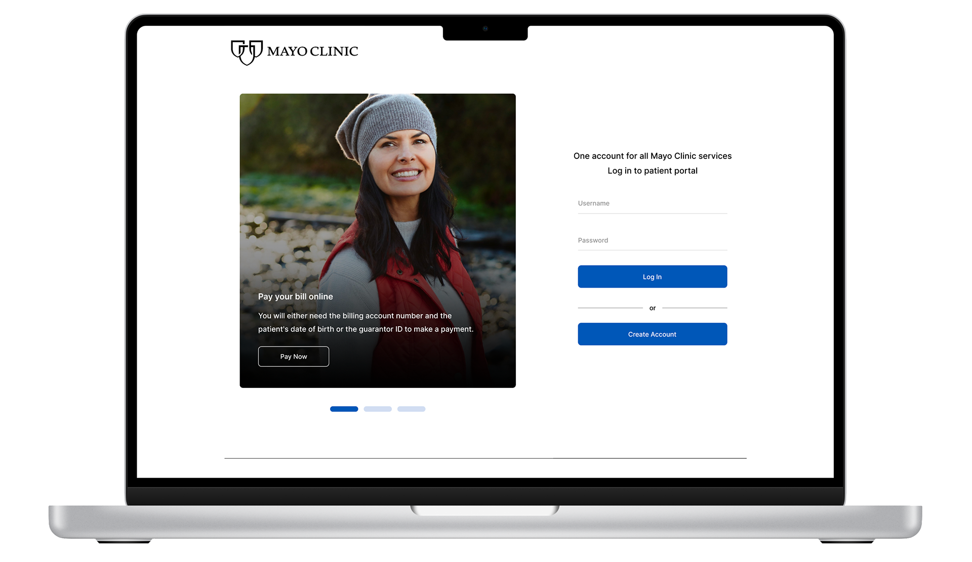
Login Page

Create Account

Login User flow
Create Account User flow
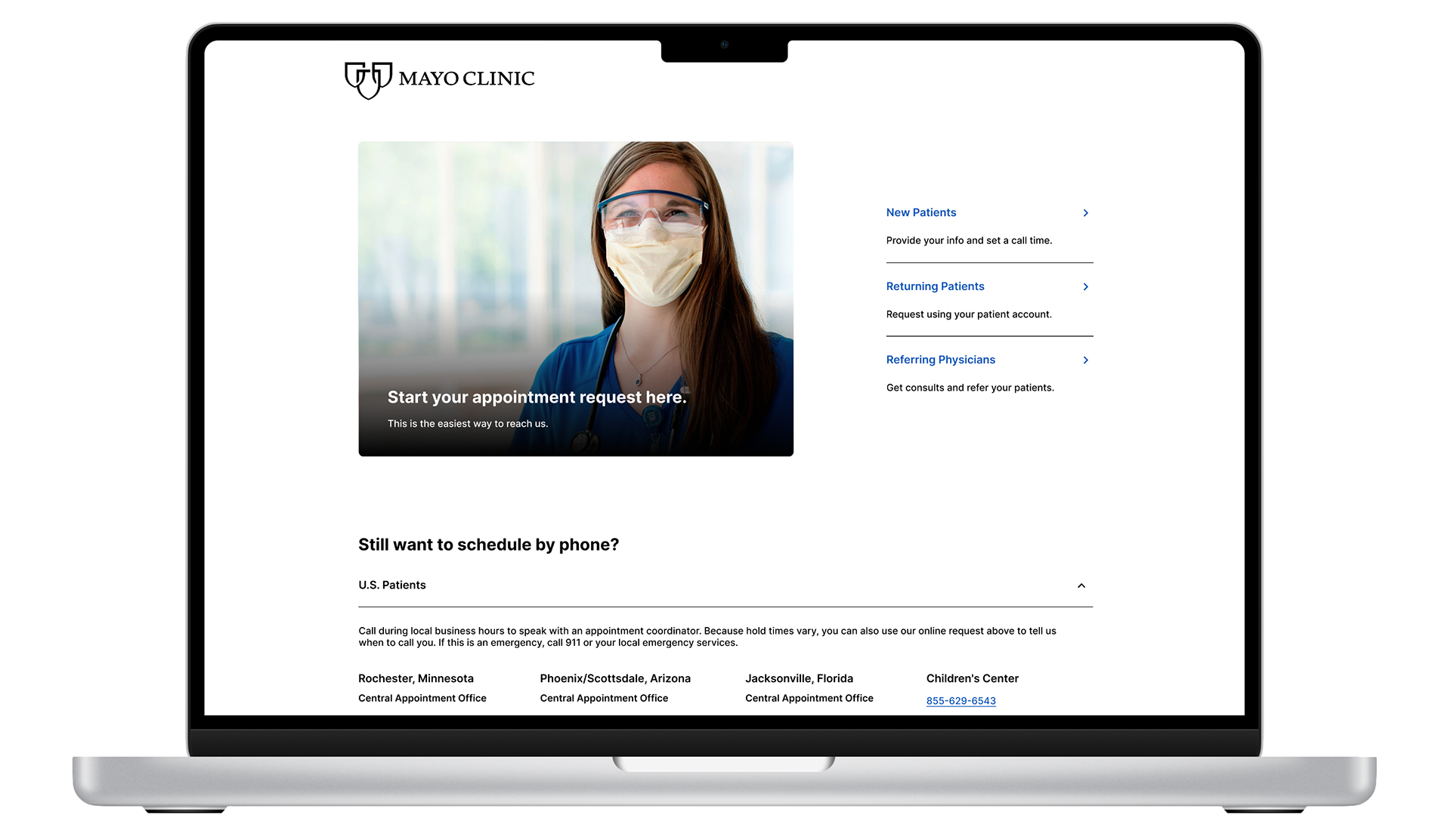
Appointment Scheduling User flow
Step 4: Usability Testing
Conducted usability testing with diverse participants to gather feedback on the redesigned flows, addressing pain points and refining the user experience.
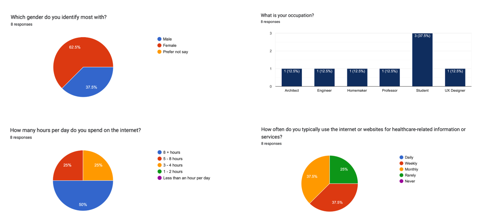
Participant profiles: Architects, Homemakers, Professors, UX designers, Engineers, and Students
Key findings:
1. Log-in interface was simple and easy for participants to complete the task.
2. The main difficulty was finding the "Create Account" option on the homepage.
3. Participants were able to create their Mayo accounts with ease.
4. Time taken to schedule an appointment greatly optimized.
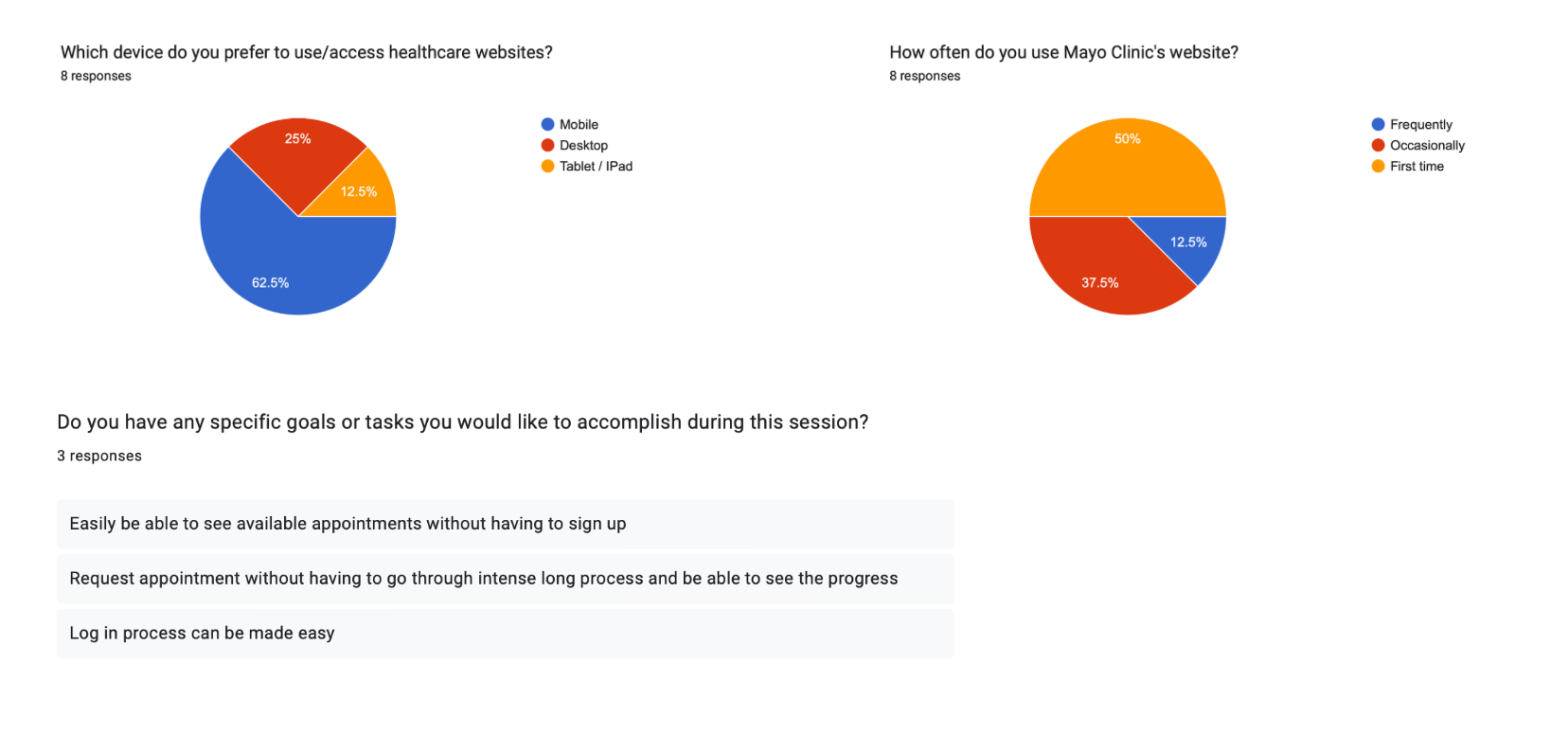
Quantitative and Qualitative Data collected from Pre-Test Questionnaire and Post-Test Questionnaire

Testing and Evaluation Results:
Quantitative Metrics:
1. 20% less time was spent on average to finish the "Request Appointment" flow.
2. 15% more successful account creations were made after user-friendly design changes were made.
Qualitative Insights:
1. Positive feedback about how simple it was to schedule appointments.
2. Participants appreciated the clarity in the account creation steps.
Lessons Learned:
1. Iterated design is crucial: Stressed the significance of iterative design. More user-centric solutions were produced by incorporating user feedback at every stage of the process.
2. Finding the Right Balance between Visual Appeal and Functional Simplicity: It's important to find the ideal balance between visual appeal and practical simplicity. The usability of a design shouldn't be sacrificed for aesthetic appeal.
3. Importance of Usability Testing: During the early stages of design, usability testing revealed insights that were not immediately apparent. It takes testing on a regular basis to improve the user experience.