
Project: UHCSR Healthcare Insurance App Redesign
Where What Why
ASU, United States iOS App Professional Project Work
Role Category When
UI/UX Designer Health, Financial Services / Insurance Feb 2024 - May 2024
Tools

The Context
UHCSR revolutionizes college healthcare. Backed by UnitedHealth Group, the largest U.S. health carrier, they offer tailored insurance plans for students.
The Problem
The UHCSR Healthcare Insurance App lacks a seamless user experience, hindering students' ability to efficiently navigate and access essential information.
The Objective
Research, strategize, and design an end-to-end app experience to facilitate seamless access to healthcare resources for students. The primary focus is to increase user engagement metrics, such as daily active users, app retention rates, and task completion rates, by 30% compared to the previous MVP.
UI/UX Design Process
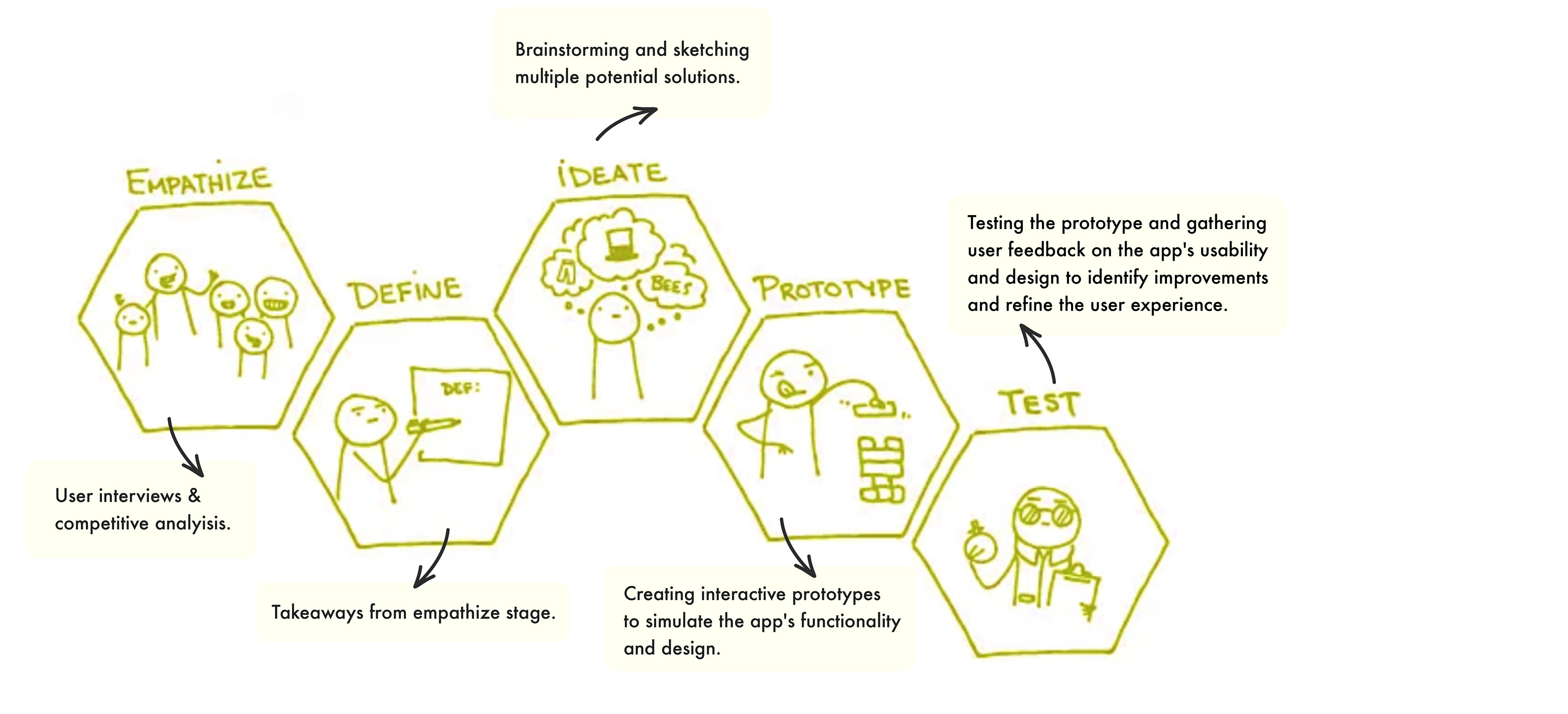
Step 1: Empathize
In the Empathize stage of the UHC Student Resources app project, I conducted user interviews and competitive analysis to understand college students' experiences with the app.
Findings:
1. Users found it challenging to locate resources within the app due to a lack of proper UI and clear navigation.
2. The app's visual design was not engaging or intuitive, making it difficult for users to interact with the app efficiently.
3. Lack of awareness about the app among students indicates the need for better promotion and visibility.
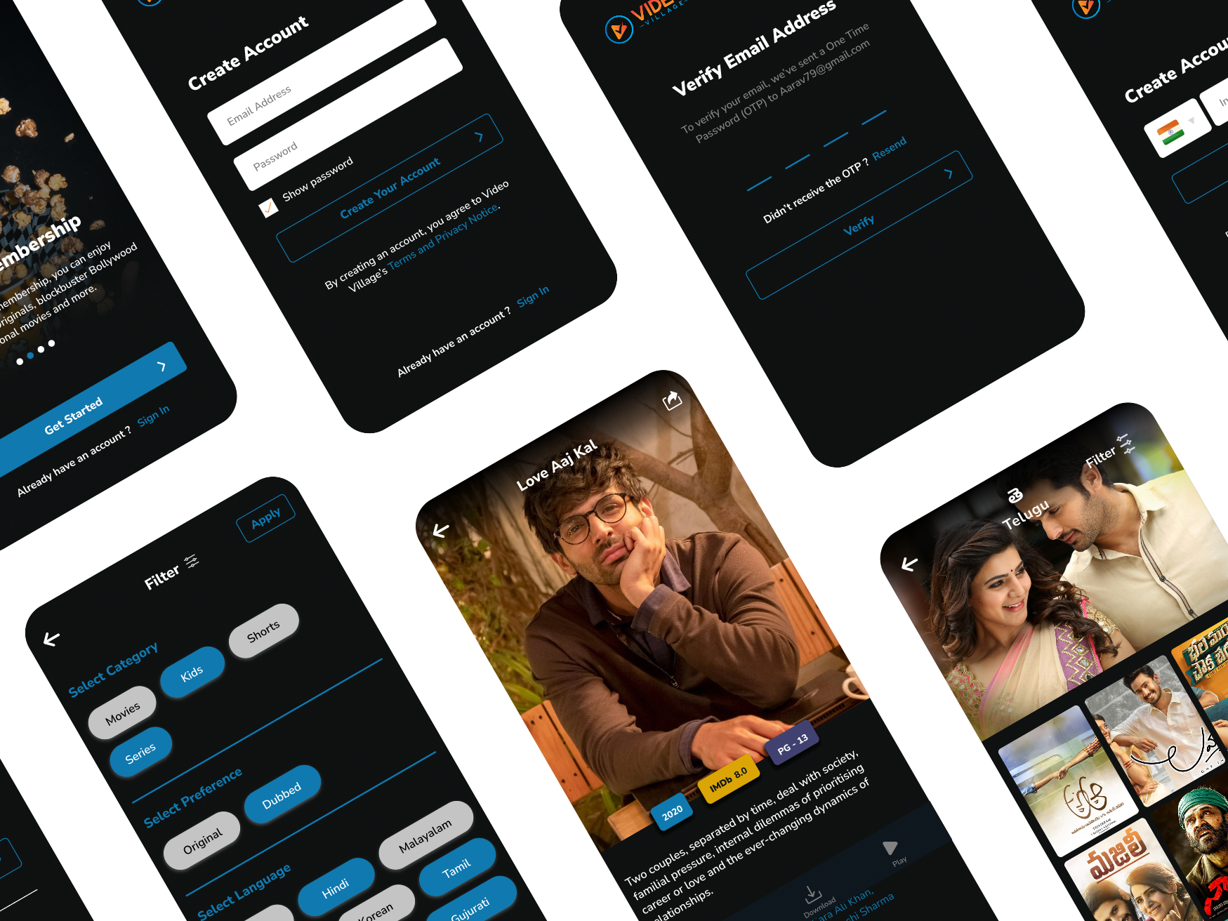
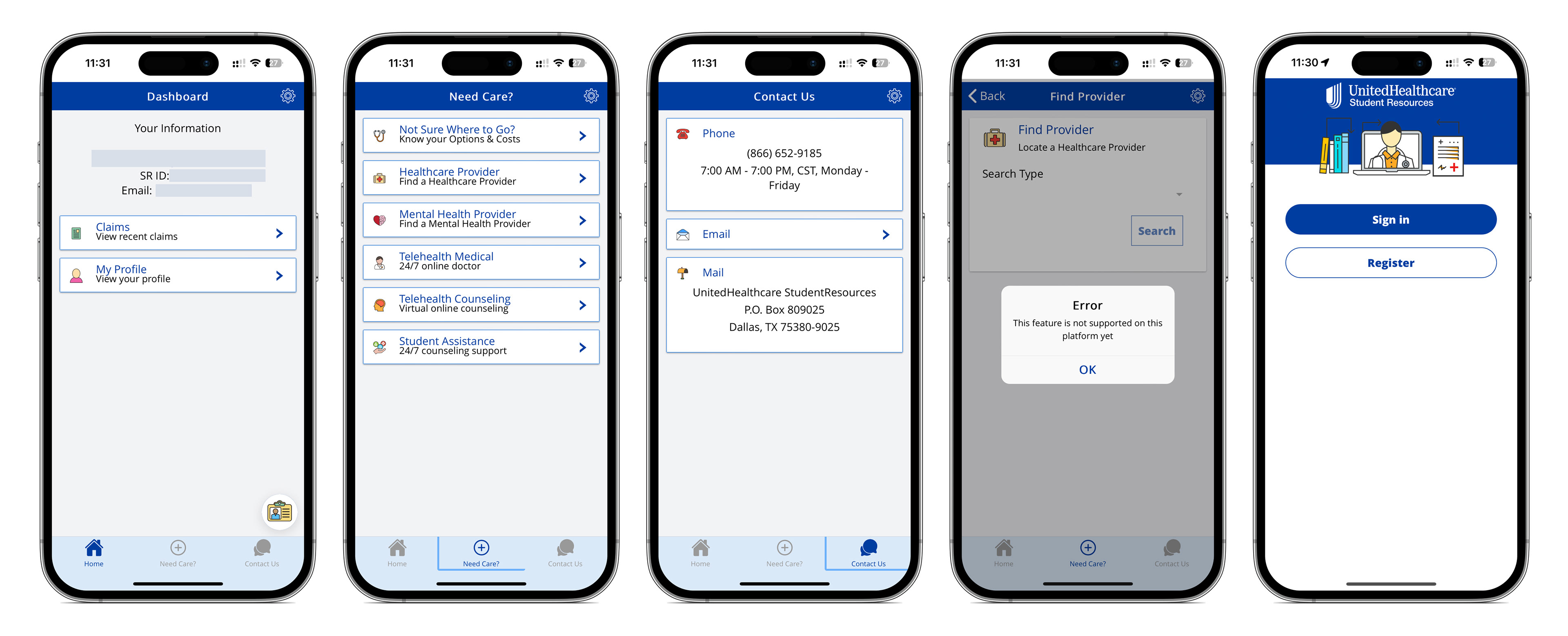
Existing App UI
Takeaways from the Empathize Stage:
1. Enhance navigation: Users faced challenges in finding resources, indicating a need for improved navigation within the app.
2. Revamp UI: The app's UI design requires an update to enhance visual appeal and user experience.
3. Increase awareness: Low app awareness among students suggests a need for strategic promotion.
4. Add proactive features: Users desire proactive notifications and visual enhancements for better usability and engagement.

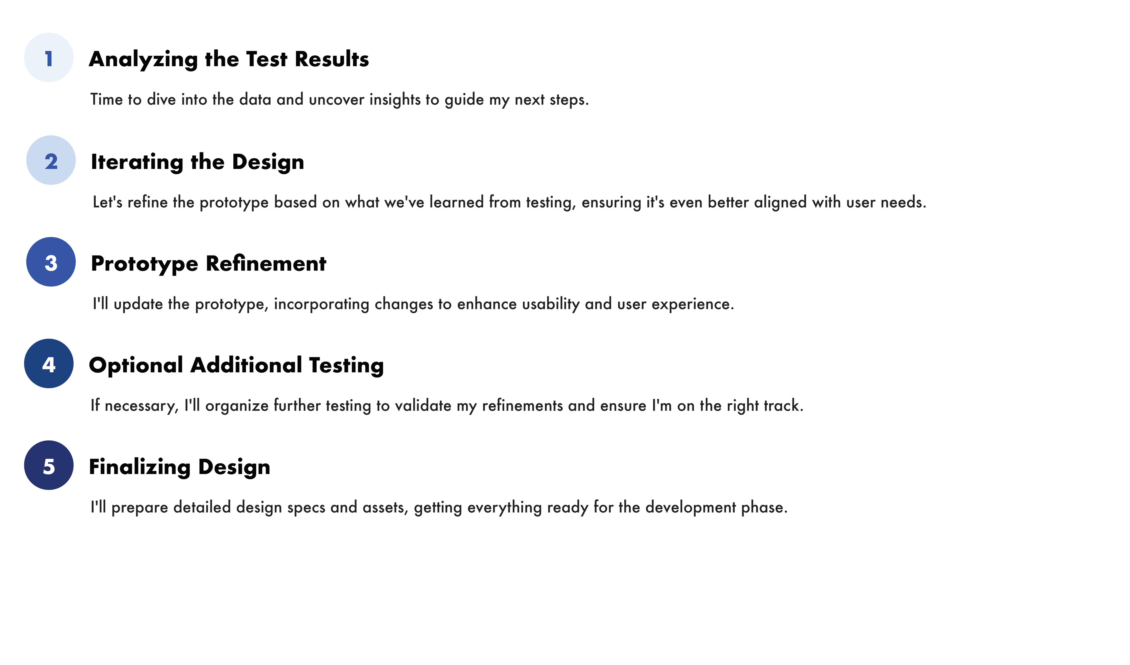
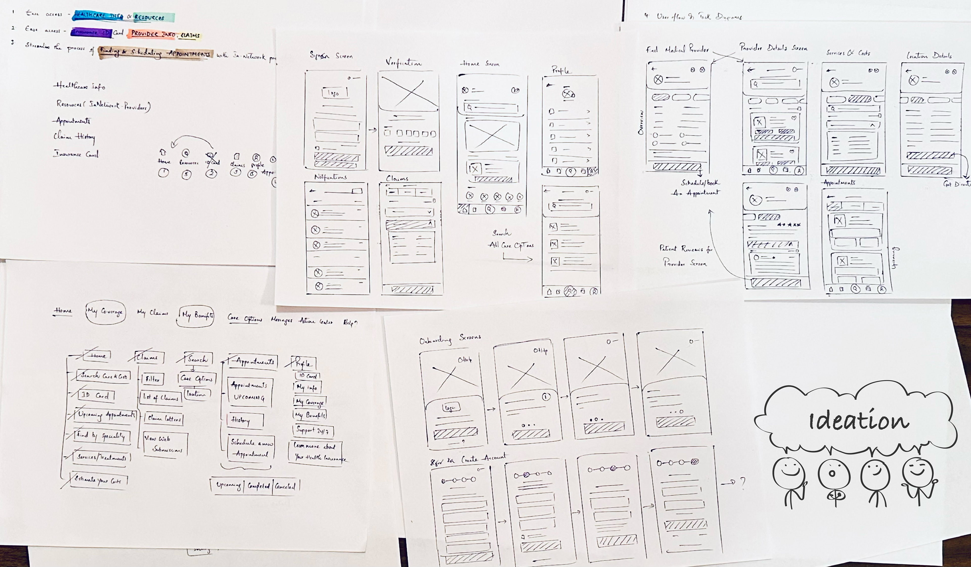
Step 3: Ideate
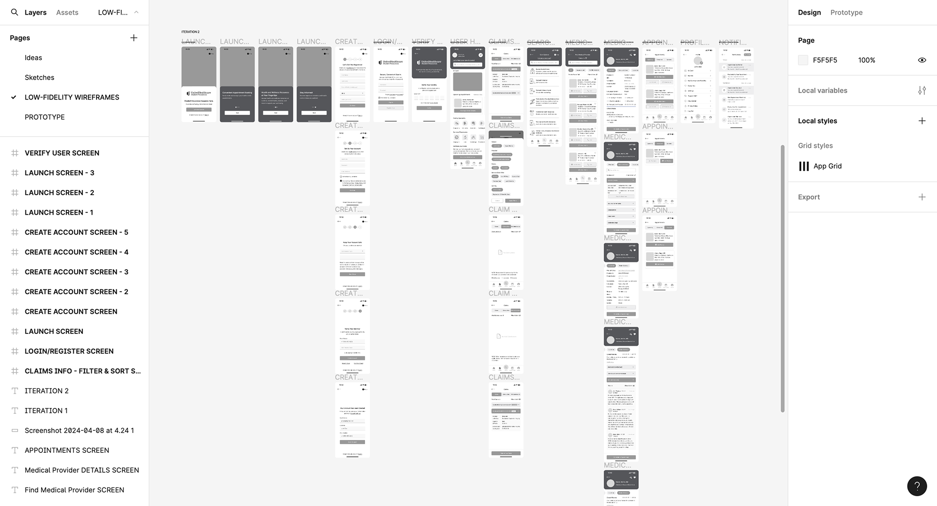
Mid-fidelity Wireframes
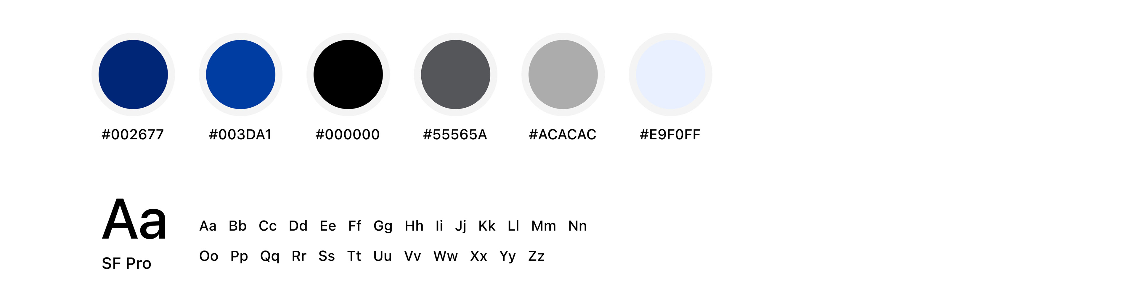
Colors and Typography
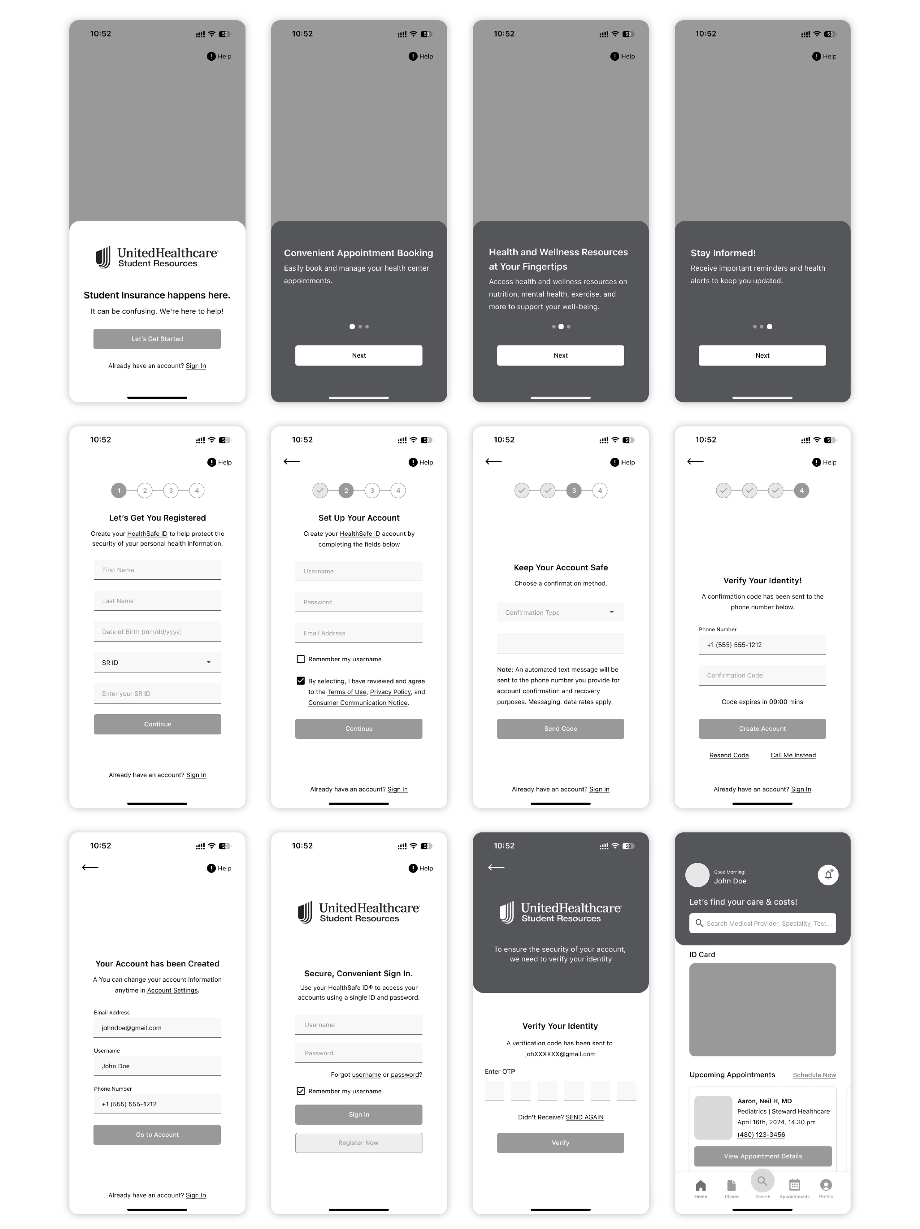
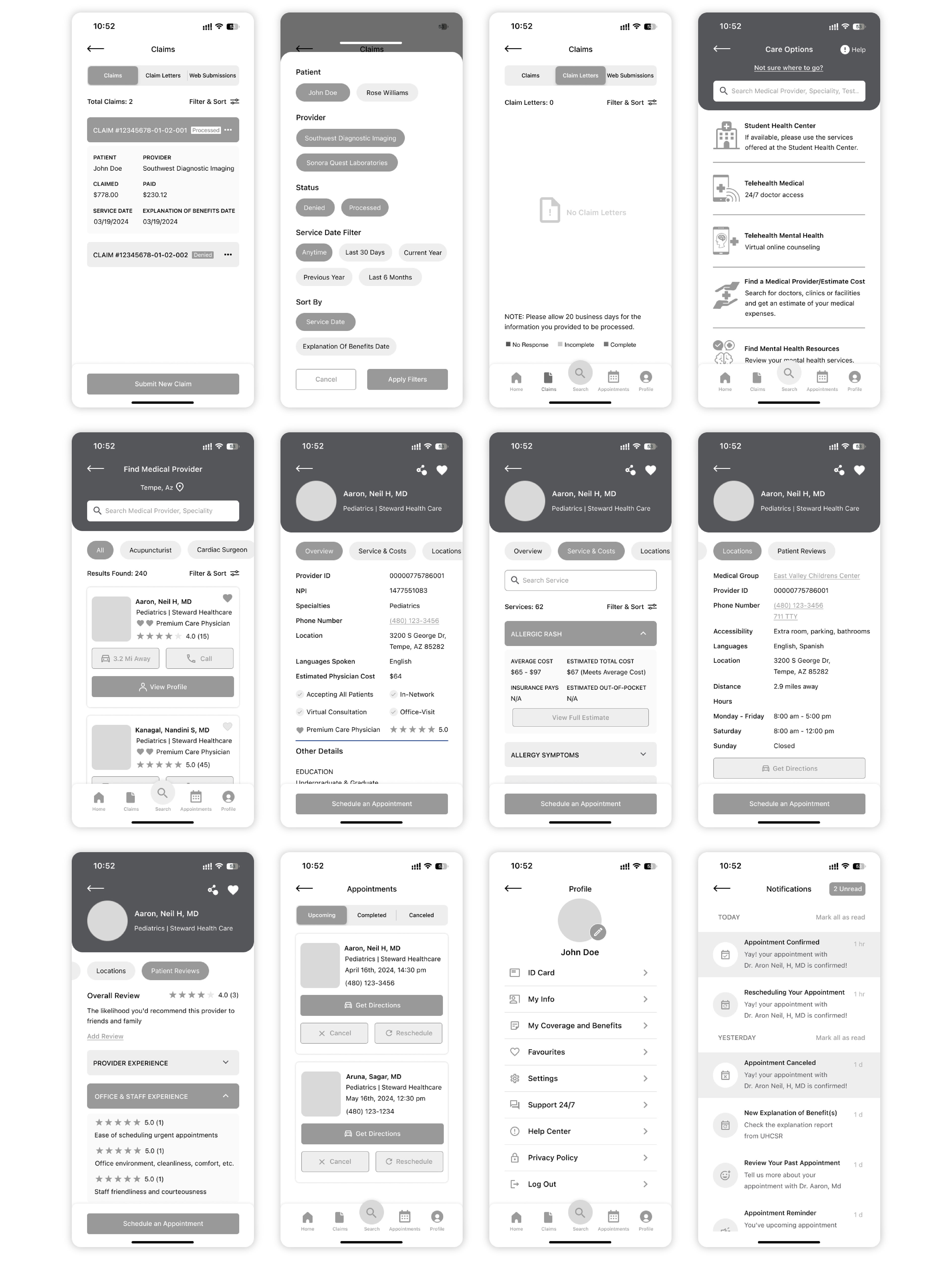
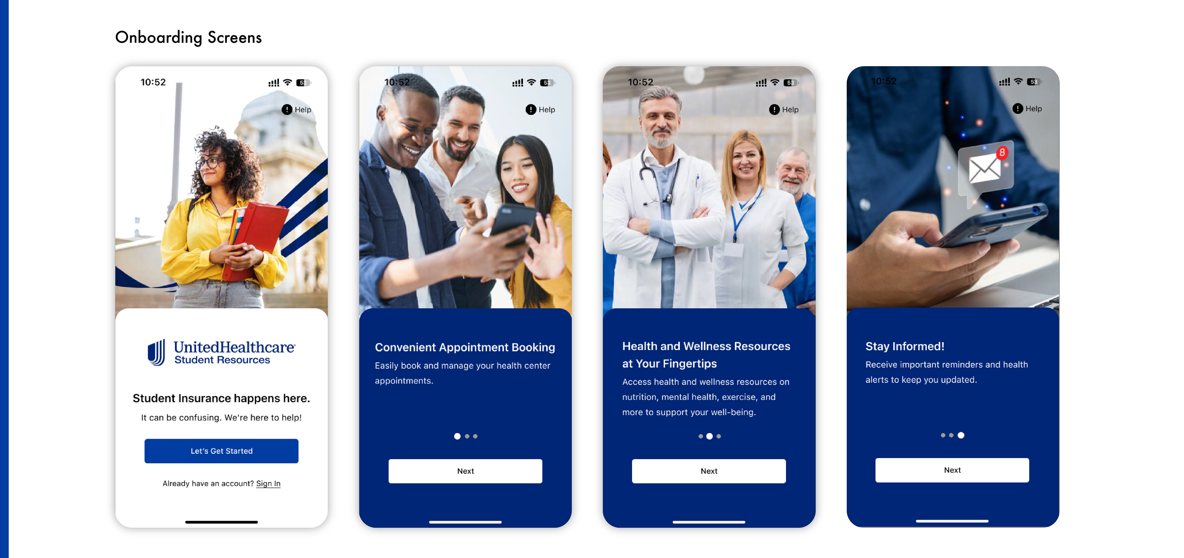
High-fidelity Wireframes


Step 5: Prototype
Step 6: Test
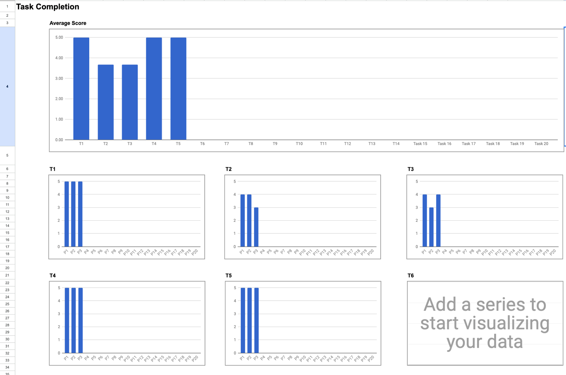
No.of Participants Total Tasks Where
3 5 via Zoom
Method of Evaluation SUS Score User Friendliness Score
SUS and Task Usability template 79.2 6
Tasks for the Participants
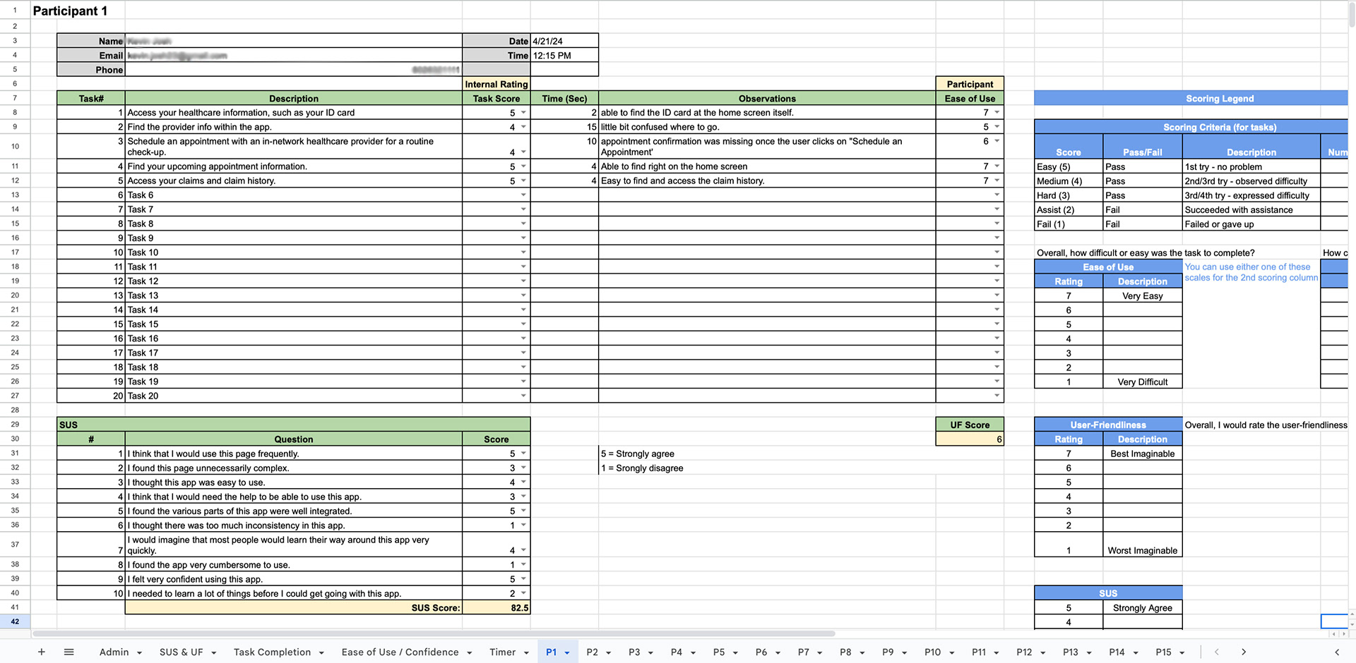
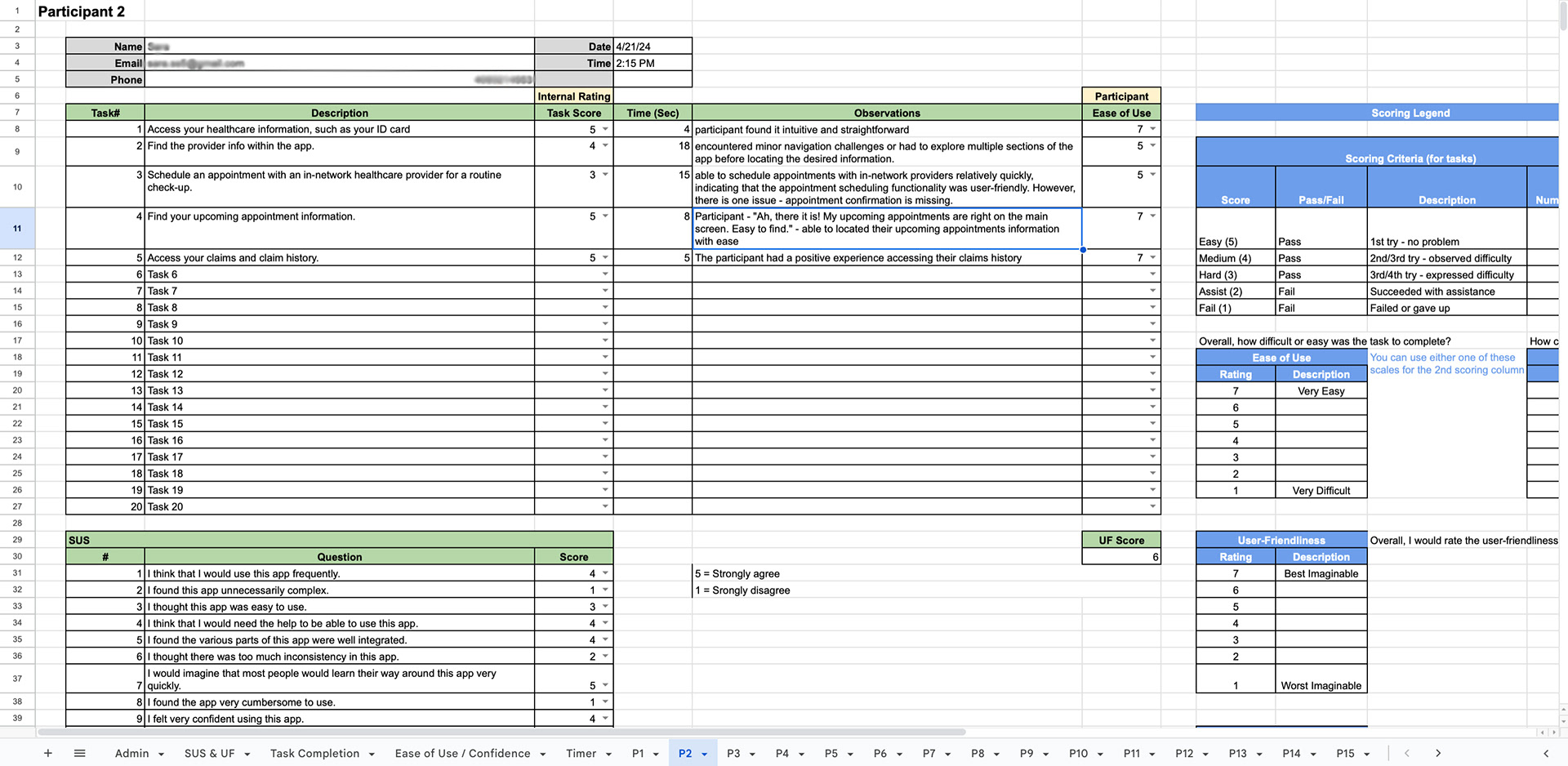
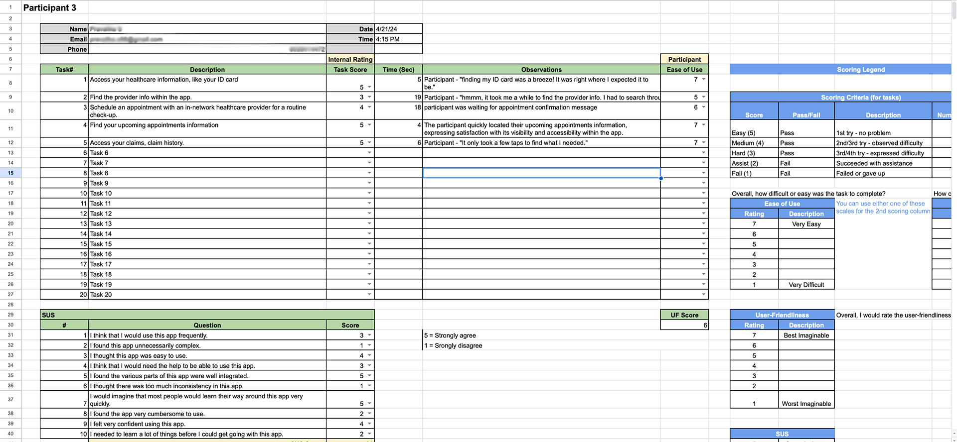
1. Access your healthcare information, such as your ID card
2. Find the provider info within the app.
3. Schedule an appointment with an in-network healthcare provider for a routine check-up.
4. Find your upcoming appointment information.
5. Access your claims and claim history.
Participant Comments
Participant 1: "Wow, that was easy! I found my ID card right away."
Participant 2: "Ah, there it is! My upcoming appointments are right on the main screen. Easy to find."
Participant 3: "finding my ID card was a breeze! It was right where I expected it to be."

Admin
SUS & User Friendliness Scores
Task Completion
Participant 1
Participant 2
Participant 3
Observations
1. Participants found it intuitive and straightforward to find their ID card information.
2. Participants encountered minor navigation challenges or had to explore a couple of sections of the app before locating the provider information.
3. Participants were able to quickly locate the upcoming appointment information.
4. Participants had a positive experience accessing their claims history.
Results:
Increased app retention rates, and task completion rates, by 30% compared to the previous MVP.
Recommendations:
1. Enhance provider information visibility: Increase the visibility of provider information by implementing a dedicated section for provider details to ensure that users can easily find and access this essential information.
2. Streamline appointment scheduling: Simplify the appointment scheduling process by providing clearer instructions and guidance. To improve usability by incorporating features such as calendar integration and real-time availability updates.
Next Steps: